AI-assisted Python Coding
Day 3: NumPy and Matplotlib
Studierendentage Physik, Uni Heidelberg, 23.-27.03.2026
Why NumPy in physics?
NumPy gives us:
Fast operations on large numeric arrays
Compact, readable code close to math notation
Reliable building blocks for SciPy, pandas, matplotlib
Key object: numpy.ndarray (usually called an “array”).
NumPy vs Python lists
Python lists store generic Python objects
NumPy arrays store homogeneous numeric data in contiguous memory
Most heavy computations run in optimized compiled code (C/Fortran under the hood)
Fewer Python-level loops → less interpreter overhead
Quick speed demo: list vs NumPy
import timeimport numpy as np= 1_000_000 # Python list approach = time.perf_counter()= list (range (n))= time.perf_counter()# NumPy approach = time.perf_counter()= np.arange(n)= a * a + 1 = time.perf_counter()print (f"list time: { t1 - t0:.4f} s" )print (f"numpy time: { t3 - t2:.4f} s" )
list time:  0.0090 s
numpy time: 0.0087 s
Creating arrays: np.array
= np.array([1.0 , 2.0 , 3.0 ])= np.array([[1 , 2 , 3 ], [4 , 5 , 6 ]])print (a)print (a.shape, a.dtype)print (b)print (b.shape, b.dtype)
[1. 2. 3.]
(3,) float64
[[1 2 3]
 [4 5 6]]
(2, 3) int64
shape tells dimensions, dtype tells numeric type.
Creating arrays: np.zeros and np.linspace
= np.zeros(5 )= np.linspace(0.0 , 10.0 , 6 )print ("zeros:" , z)print ("linspace:" , grid)
zeros: [0. 0. 0. 0. 0.]
linspace: [ 0.  2.  4.  6.  8. 10.]
np.zeros(n): n zerosnp.linspace(start, stop, num): evenly spaced grid (including endpoints)
Physics mini-example with linspace
Compute free-fall distance \(s(t)=\tfrac{1}{2}gt^2\) on a time grid.
= 9.81 = np.linspace(0.0 , 2.0 , 5 )= 0.5 * g * t** 2 print ("s:" , s)
s: [ 0. 1.22625 4.905 11.03625 19.62 ]
Basic indexing and slicing (1D)
= np.array([10 , 20 , 30 , 40 , 50 ])print ("x[0] =" , x[0 ])print ("x[-1] =" , x[- 1 ])print ("x[1:4] =" , x[1 :4 ])print ("x[:3] =" , x[:3 ])print ("x[::2] =" , x[::2 ])
x[0]   = 10
x[-1]  = 50
x[1:4] = [20 30 40]
x[:3]  = [10 20 30]
x[::2] = [10 30 50]
2D arrays: indexing and slicing
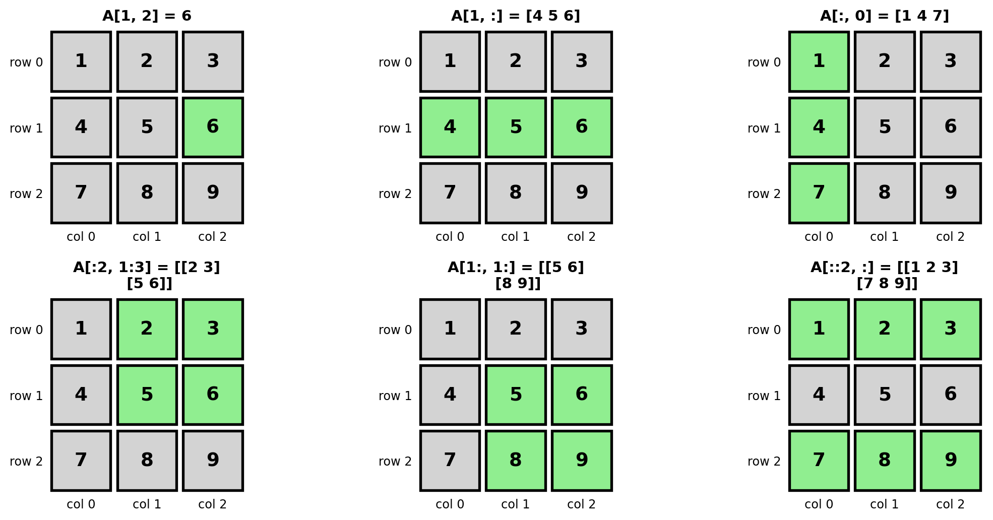
= np.array([[1 , 2 , 3 ],4 , 5 , 6 ],7 , 8 , 9 ]])print ("A shape:" , A.shape)print ("A[1, 2] =" , A[1 , 2 ])print ("row 1 =" , A[1 , :])print ("col 0 =" , A[:, 0 ])print ("block = \n " , A[:2 , 1 :3 ])
A shape: (3, 3)
A[1, 2] = 6
row 1   = [4 5 6]
col 0   = [1 4 7]
block   =
 [[2 3]
 [5 6]]
Visual guide to 2D slicing
Concatenation: combining arrays
= np.array([1 , 2 , 3 ])= np.array([4 , 5 ])print ("1D concatenate:" , np.concatenate([a, b]))= np.array([[1 , 2 ], [3 , 4 ]])= np.array([[5 , 6 ]])print ("axis=0: \n " , np.concatenate([M1, M2], axis= 0 ))print ("axis=1: \n " , np.concatenate([M1, M2.T], axis= 1 ))
1D concatenate: [1 2 3 4 5]
axis=0:
 [[1 2]
 [3 4]
 [5 6]]
axis=1:
 [[1 2 5]
 [3 4 6]]
Elementwise math: operators and functions
= np.array([1.0 , 2.0 , 3.0 ])= np.array([10.0 , 20.0 , 30.0 ])print ("x + y ->" , x + y)print ("np.add ->" , np.add(x, y))print ("x * y ->" , x * y)print ("np.multiply->" , np.multiply(x, y))print ("x**2 ->" , x** 2 )print ("np.sqrt(y) ->" , np.sqrt(y))print ("method sum ->" , x.sum ())
x + y      -> [11. 22. 33.]
np.add     -> [11. 22. 33.]
x * y      -> [10. 40. 90.]
np.multiply-> [10. 40. 90.]
x**2       -> [1. 4. 9.]
np.sqrt(y) -> [3.16227766 4.47213595 5.47722558]
method sum -> 6.0
Math functions are elementwise by default.
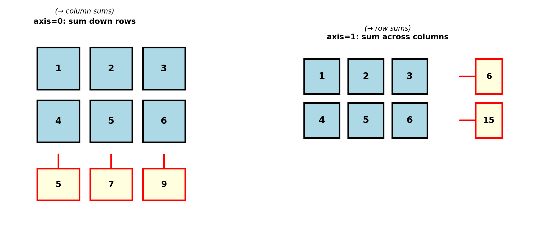
Summing over a given axis
= np.array([[1 , 2 , 3 ],4 , 5 , 6 ]])print ("sum all ->" , np.sum (M))print ("sum axis=0 ->" , np.sum (M, axis= 0 ))print ("sum axis=1 ->" , np.sum (M, axis= 1 ))
sum all      -> 21
sum axis=0   -> [5 7 9]
sum axis=1   -> [ 6 15]
Masking (boolean indexing)
= np.array([- 2.0 , - 0.5 , 0.0 , 1.2 , 3.4 ])= values > 0 print ("mask:" , mask)print ("positive values:" , values[mask])print ("same shortcut:" , values[values > 0 ])
mask: [False False False  True  True]
positive values: [1.2 3.4]
same shortcut: [1.2 3.4]
Exercise: clean measurements with a mask
You recorded count rates (counts/min). Accept only values in a plausible window.
= np.array([1200 , 1180 , 1050 , 980 , 930 , 760 , 870 , 820 ])= 850 , 1100
Tasks:
Build a boolean mask for accepted values in the interval [low, high].
Extract accepted values into accepted.
Compute the mean only of accepted.
Print accepted values below 900.
Solution: clean measurements with a mask
= np.array([1200 , 1180 , 1050 , 980 , 930 , 760 , 870 , 820 ])= 850 , 1100 = (rates >= low) & (rates <= high)= rates[window_mask]= accepted < 900 print ("window mask:" , window_mask)print ("accepted:" , accepted)print ("mean(accepted):" , np.mean(accepted))print ("accepted below 900:" , accepted[low_mask])
window mask: [False False  True  True  True False  True False]
accepted: [1050  980  930  870]
mean(accepted): 957.5
accepted below 900: [870]
Numerical Pitfalls: floating-point comparisons
import numpy as np= 0.1 + 0.2 = 0.3 print ("a == b:" , a == b)print ("isclose:" , np.isclose(a, b))
a == b: False
isclose: True
Internally (floating point representation):
Floats are stored as binary numbers. Values like 0.5 (= 1/2, a power of 2 denominator) are exactly representable, while 0.1 or 0.2 are not exact in binary.
Use np.isclose / np.allclose instead of direct equality for floating-point data.
Special values inNumPy: np.nan, np.inf
import numpy as np= np.array([1.0 , np.nan, np.inf, 4.0 ])= np.isfinite(values)print ("finite mask:" , mask)print ("clean values:" , values[mask])
finite mask: [ True False False  True]
clean values: [1. 4.]
Before math operations, check for np.nan or np.inf:
check np.isfinite(data).all()
or filter with data[np.isfinite(data)]
Broadcasting: same operation, different shapes
Broadcasting means NumPy can combine arrays with different shapes when dimensions are compatible.
= np.array([[1 , 2 , 3 ],4 , 5 , 6 ]]) # shape (2, 3) = np.array([10 , 20 , 30 ]) # shape (3,) = X + vprint ("X shape:" , X.shape)print ("v shape:" , v.shape)print ("Y = X + v: \n " , Y)
X shape: (2, 3)
v shape: (3,)
Y = X + v:
 [[11 22 33]
 [14 25 36]]
Here, v is added to each row of X.
Broadcasting with a 2D column vector
= np.array([[1 , 2 , 3 ],4 , 5 , 6 ]])= np.array([[100 ], [200 ]]) # shape (2, 1) print ("X + c: \n " , X + c)
X + c:
 [[101 102 103]
 [204 205 206]]
Now each row gets a different offset.
Exercise: sensor calibration with broadcasting
You measured raw temperatures from 3 sensors over 4 time points.
Use broadcasting to apply a per-sensor calibration and a per-time drift correction:
= np.array([20.10 , 20.40 , 20.80 , 21.00 ],19.70 , 20.00 , 20.30 , 20.60 ],20.50 , 20.80 , 21.10 , 21.50 ]= np.array([[0.15 ], [- 0.05 ], [0.10 ]]) # shape (3, 1) = np.array([0.00 , - 0.02 , - 0.04 , - 0.06 ]) # shape (4,)
Tasks:
Compute corrected = raw + sensor_offset + time_drift.
Print the shapes of all arrays involved.
Compute the mean corrected temperature per sensor (axis=1).
Solution: sensor calibration with broadcasting
= np.array([20.10 , 20.40 , 20.80 , 21.00 ],19.70 , 20.00 , 20.30 , 20.60 ],20.50 , 20.80 , 21.10 , 21.50 ]= np.array([[0.15 ], [- 0.05 ], [0.10 ]])= np.array([0.00 , - 0.02 , - 0.04 , - 0.06 ])= raw + sensor_offset + time_driftprint ("raw shape:" , raw.shape)print ("sensor_offset shape:" , sensor_offset.shape)print ("time_drift shape:" , time_drift.shape)print ("corrected shape:" , corrected.shape)print ("mean per sensor:" , np.mean(corrected, axis= 1 ))
raw shape: (3, 4)
sensor_offset shape: (3, 1)
time_drift shape: (4,)
corrected shape: (3, 4)
mean per sensor: [20.695 20.07  21.045]
sensor_offset is broadcast across columns and time_drift across rows, so NumPy can align dimensions automatically.
Outer product of two arrays via broadcasting
= np.array([1 , 2 , 3 ]) # shape (3,) = np.array([10 , 20 , 30 ]) # shape (3,) = a[:, np.newaxis] * b[np.newaxis, :]
a[:, np.newaxis]
[[ 1]
 [ 2]
 [ 3]]

b[np.newaxis, :]
[[10 20 30]]

outer product:
[[ 10  20  30]
 [ 20  40  60]
 [ 30  60  90]]
None can be used instead of np.newaxis, for example:
Exercise: pairwise distances via broadcasting
Given 2D particle positions:
= np.array([0.0 , 0.0 ],1.0 , 0.0 ],0.0 , 2.0 ],2.0 , 1.0 ]
Tasks:
Build diff with shape (N, N, 2) containing all pairwise vectors pos[i] - pos[j].
From diff, compute the Euclidean distance matrix D with shape (N, N).
Verify that D is symmetric and has zeros on the diagonal.
Find the index of the nearest neighbor for each particle (excluding itself).
Solution: pairwise distances via broadcasting
= np.array([0.0 , 0.0 ],1.0 , 0.0 ],0.0 , 2.0 ],2.0 , 1.0 ]= pos[:, None , :] - pos[None , :, :] # (N, N, 2) -> None inserts a new axis = np.linalg.norm(diff, axis= 2 ) # (N, N) print ("D = \n " , D)print ("symmetric:" , np.allclose(D, D.T))print ("diag zero:" , np.allclose(np.diag(D), 0.0 ))# Exclude self-distance by setting diagonal to +inf = D.copy()= np.argmin(D_no_self, axis= 1 )print ("nearest neighbor index:" , nearest)
D =
 [[0.         1.         2.         2.23606798]
 [1.         0.         2.23606798 1.41421356]
 [2.         2.23606798 0.         2.23606798]
 [2.23606798 1.41421356 2.23606798 0.        ]]
symmetric: True
diag zero: True
nearest neighbor index: [1 0 0 1]
Broadcasting explanation: what None does
= np.array([0.0 , 0.0 ],1.0 , 0.0 ],0.0 , 2.0 ],2.0 , 1.0 ]print ("pos.shape ->" , pos.shape) # (4, 2) print ("pos[:, None, :].shape ->" , pos[:, None , :].shape) # (4, 1, 2) print ("pos[None, :, :].shape ->" , pos[None , :, :].shape) # (1, 4, 2)
pos.shape       -> (4, 2)
pos[:, None, :].shape -> (4, 1, 2)
pos[None, :, :].shape -> (1, 4, 2)
Shape alignment in broadcasting:
Broadcasting explanation: values of pos[:, None, :] and pos[None, :, :]
ASCII diagram (great for slides / explanation)
Broadcasting intuition: None means “add a loop axis”
Think of None as: “I want another loop here”.
pos[:, None, :] means:
“For each point i, compare it against all j.”
So mentally translate
for i in range (N):for j in range (N):= pos[i] - pos[j]None lets NumPy create this pairwise structure without writing explicit Python loops.
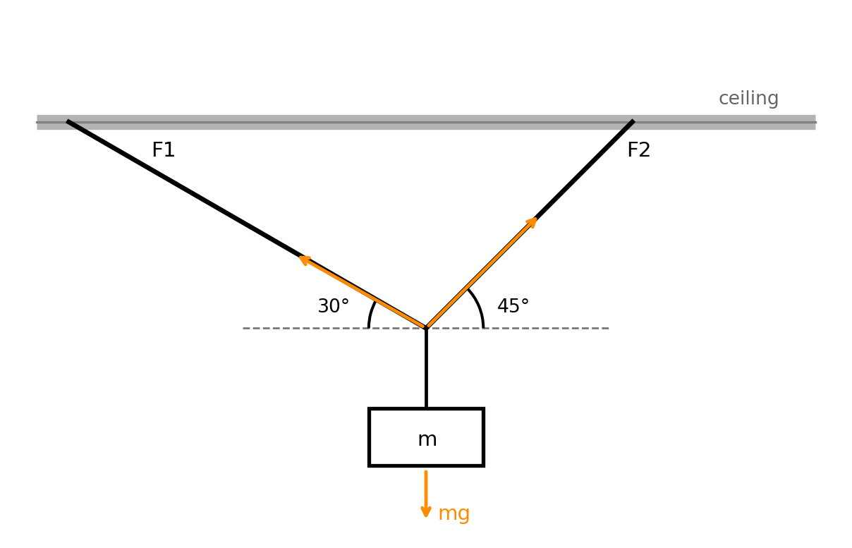
Physics setup: two cables in static equilibrium
We model a mass \(m\) hanging from two cables with unknown forces \(F_1\) and \(F_2\) .
At the knot, horizontal and vertical force balance gives a \(2\times2\) linear system.
Solving linear equations (physics example)
Static equilibrium with two cables holding a mass:
\[
\begin{aligned}
F_1\cos(30^\circ) - F_2\cos(45^\circ) &= 0,\\
F_1\sin(30^\circ) + F_2\sin(45^\circ) &= mg.
\end{aligned}
\]
Unknowns are forces \(F_1, F_2\) .
= 10.0 = 9.81 = np.array([30 )), - np.cos(np.deg2rad(45 ))],30 )), np.sin(np.deg2rad(45 ))]= np.array([0.0 , m * g])= np.linalg.solve(A, b)print (f"F1 = { F1:.2f} N, F2 = { F2:.2f} N" )
F1 = 71.81 N, F2 = 87.95 N
Determinant and inverse
= np.linalg.det(A)= np.linalg.inv(A)print ("det(A) =" , detA)print ("A^{-1} = \n " , A_inv)print ("check A @ A^{-1} = \n " , A @ A_inv)
det(A) = 0.9659258262890682
A^{-1} =
 [[ 0.73205081  0.73205081]
 [-0.51763809  0.89657547]]
check A @ A^{-1} =
 [[1.00000000e+00 1.71557540e-17]
 [1.46197479e-17 1.00000000e+00]]
det(A) = 0 means singular matrix (no unique solution)In practice, prefer np.linalg.solve(A, b) over explicitly computing the inverse
Exercise: system of linear equations
Solve the following \(3 \times 3\) system for \(x_1, x_2, x_3\) :
\[
\begin{aligned}
2x_1 - x_2 + 3x_3 &= 9\\
4x_1 + 2x_2 - x_3 &= 5\\
-x_1 + 3x_2 + 2x_3 &= 7
\end{aligned}
\]
Tasks:
Assemble the coefficient matrix A and right-hand side b as NumPy arrays.
Check that np.linalg.det(A) != 0.
Solve with np.linalg.solve.
Verify: check that A @ x ≈ b using np.allclose.
Solution: system of linear equations
= np.array([2.0 , - 1.0 , 3.0 ],4.0 , 2.0 , - 1.0 ],- 1.0 , 3.0 , 2.0 ]= np.array([9.0 , 5.0 , 7.0 ])print (f"det(A) = { np. linalg. det(A):.4f} " )= np.linalg.solve(A, b)print (f"x1 = { x[0 ]:.4f} , x2 = { x[1 ]:.4f} , x3 = { x[2 ]:.4f} " )print ("A @ x ≈ b:" , np.allclose(A @ x, b))
det(A) = 63.0000
x1 = 1.3175, x2 = 1.1111, x3 = 2.4921
A @ x ≈ b: True
NumPy Summary
NumPy arrays are fast and expressive for scientific computing
Core skills:
create arrays (array, zeros, linspace)
index/slice 1D and 2D arrays
combine arrays (concatenate)
use elementwise math, masking, axis sums
use broadcasting for shape-aware computations
solve linear systems with np.linalg.solve
Next: plotting NumPy results with Matplotlib.
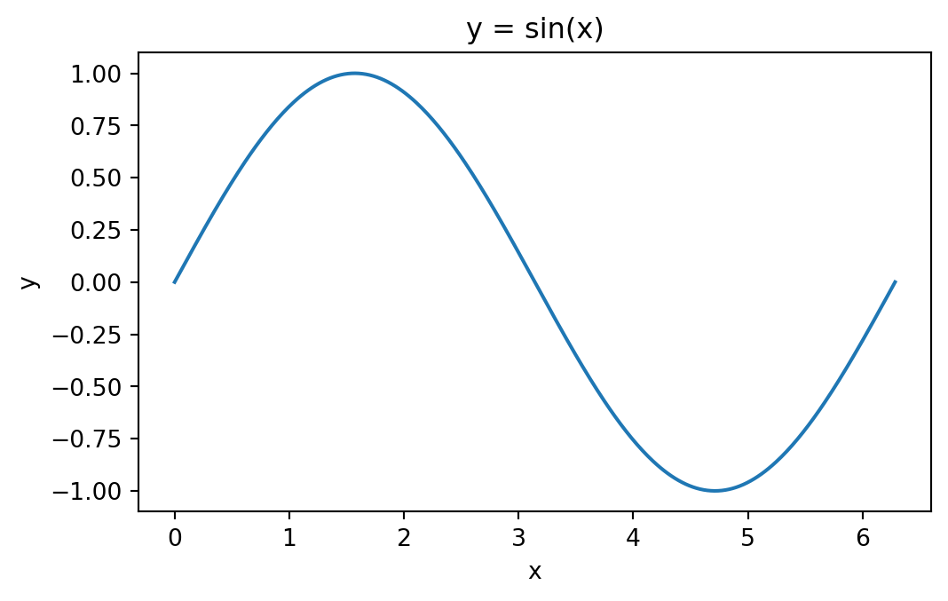
Matplotlib: first plot of a 1D function
matplotlib is the standard plotting library in Python.
import matplotlib.pyplot as plt= np.linspace(0 , 2 * np.pi, 400 )= np.sin(x)= (6 , 3.5 ))"y = sin(x)" )"x" )"y" )
1D function: example plot
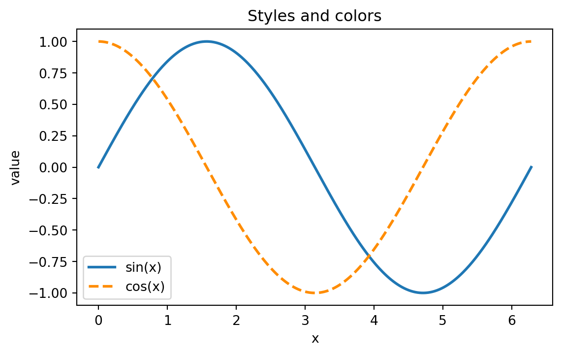
Line styles and colors
= np.linspace(0 , 2 * np.pi, 400 )= (6.5 , 3.8 ))= "tab:blue" , linestyle= "-" , linewidth= 2 , label= "sin(x)" )= "darkorange" , linestyle= "--" , linewidth= 2 , label= "cos(x)" )"x" )"value" )"Styles and colors" )
Line styles and colors: example plot
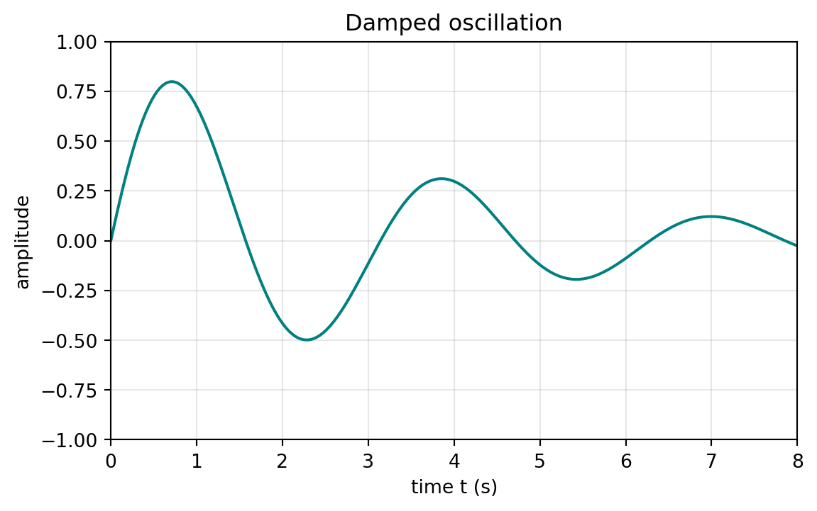
Axis labels, title, and plot ranges
= np.linspace(0 , 10 , 300 )= np.exp(- 0.3 * x) * np.sin(2 * x)= (6.5 , 3.8 ))= "teal" )"Damped oscillation" )"time t (s)" )"amplitude" )0 , 8 )- 1.0 , 1.0 )True , alpha= 0.3 )
Plot ranges: example plot
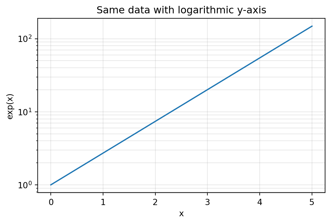
Log scale
Useful when values span many orders of magnitude.
= np.linspace(0 , 5 , 200 )= np.exp(x)= (6.2 , 3.8 ))"log" )"x" )"exp(x)" )"Same data with logarithmic y-axis" )True , which= "both" , alpha= 0.3 )
Read measurement data with NumPy
Now we use NumPy file I/O (np.loadtxt) instead of manual parsing.
= "data/data_rate_vs_thickness_pb.csv" = np.loadtxt(file_path, delimiter= "," , comments= "#" )= data[:, 0 ]= data[:, 1 ]
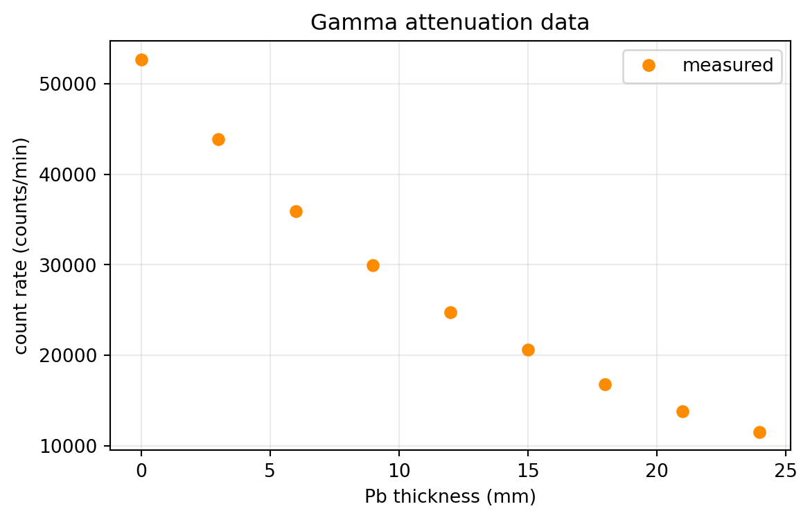
(array([ 0.,  3.,  6.,  9., 12., 15., 18., 21., 24.]),
 array([52644., 43823., 35922., 29968., 24771., 20633., 16839., 13816.,
        11576.]))
Plot data points: count rate vs absorber thickness
= (6.6 , 4.0 ))"o" , color= "darkorange" , label= "measured" )"Pb thickness (mm)" )"count rate (counts/min)" )"Gamma attenuation data" )True , alpha= 0.25 )
Count rate vs absorber thickness: example plot
Error bars
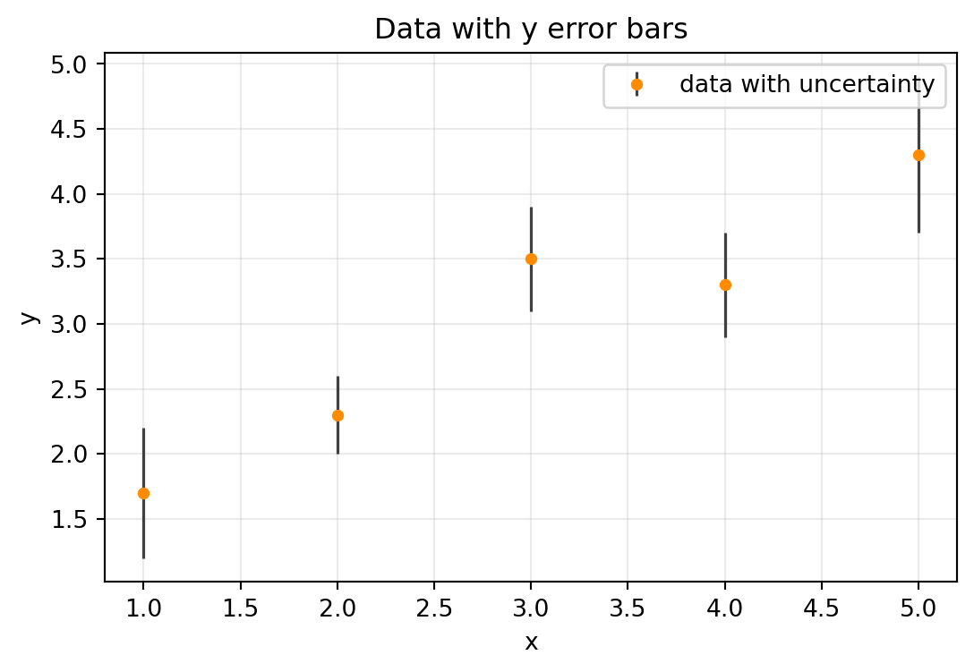
Example data with measured values \(y\) and uncertainties \(\sigma_y\) .
= np.array([1 , 2 , 3 , 4 , 5 ])= np.array([1.7 , 2.3 , 3.5 , 3.3 , 4.3 ])= np.array([0.5 , 0.3 , 0.4 , 0.4 , 0.6 ])= (6.4 , 4.0 ))= sigma_y,= "o" ,= 4 ,= "darkorange" ,= "0.25" ,= 1.2 ,= 0 ,= "data with uncertainty" "x" )"y" )"Data with y error bars" )True , alpha= 0.25 )
Histogram plotting
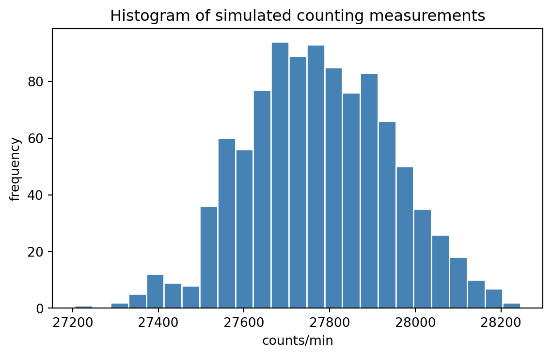
Example: distribution of many simulated count values around one mean.
= np.random.default_rng(42 )= rng.poisson(lam= np.mean(count_rate), size= 1000 )= (6.8 , 3.9 ))= 25 , color= "steelblue" , edgecolor= "white" )"counts/min" )"frequency" )"Histogram of simulated counting measurements" )
Planck spectrum of the Sun
Use Planck’s law
\[
B(\lambda, T) = \frac{2hc^2}{\lambda^5}\,\frac{1}{\exp\!\left(\frac{hc}{\lambda k_B T}\right)-1}
\]
with \(h\) , \(c\) , and \(k_B\) as usual constants.
For \(T = 5778\,\mathrm{K}\) :
Build \(\lambda\) from \(200\) to \(3000\) nm (convert to meters) and compute \(B(\lambda,T)\) .
Convert to per-nanometer units and plot \(B\) vs wavelength (nm) with labels and grid.
Print the peak wavelength in nm.
Solution: Planck spectrum of the Sun
= 6.62607015e-34 # Planck constant (J s) = 2.99792458e8 # speed of light (m/s) = 1.380649e-23 # Boltzmann constant (J/K) = 5778.0 # solar surface temperature (K) = np.linspace(200.0 , 3000.0 , 1000 )= lam_nm * 1e-9 = (2 * h * c** 2 ) / (lam** 5 ) / (np.exp((h * c) / (lam * k_B * T)) - 1 )= B * 1e-9 # convert from per meter to per nanometer = np.argmax(B)= lam_nm[imax]print (f"Peak wavelength: { lam_max_nm:.1f} nm" )
Peak wavelength: 502.7 nm
= (7 , 4 ))= "tab:blue" , linewidth= 2 )"wavelength (nm)" )r" $ B_ \ lambda $ ( W m $^ {-2} $ sr $^ {-1} $ nm $^ {-1} $ ) " )"Planck spectrum at T = 5778 K" )True , alpha= 0.3 )
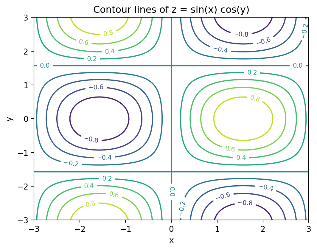
Contour plot (2D scalar field)
= np.linspace(- 3 , 3 , 200 )= np.linspace(- 3 , 3 , 180 )= np.meshgrid(x, y)= np.sin(X) * np.cos(Y)= (6.2 , 4.6 ))= plt.contour(X, Y, Z, levels= 12 , cmap= "viridis" )= True , fontsize= 8 )"x" )"y" )"Contour lines of z = sin(x) cos(y)" )
Contour plot: example plot
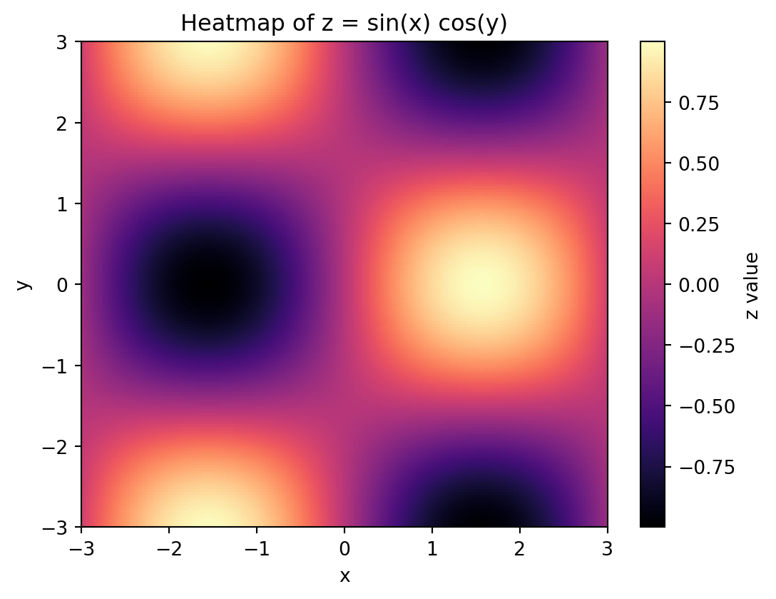
Heatmap (same field as color map)
= (6.2 , 4.6 ))= plt.imshow(= "lower" ,= [x.min (), x.max (), y.min (), y.max ()],= "auto" ,= "magma" = "z value" )"x" )"y" )"Heatmap of z = sin(x) cos(y)" )
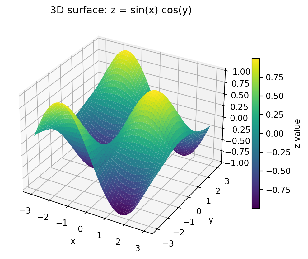
3D surface plot
= plt.figure(figsize= (7.0 , 5.0 ))= fig.add_subplot(111 , projection= "3d" )= ax.plot_surface(X, Y, Z, cmap= "viridis" , linewidth= 0 , antialiased= True )"x" )"y" )"z" )"3D surface: z = sin(x) cos(y)" )= 0.65 , label= "z value" )
3D surface plot: example plot
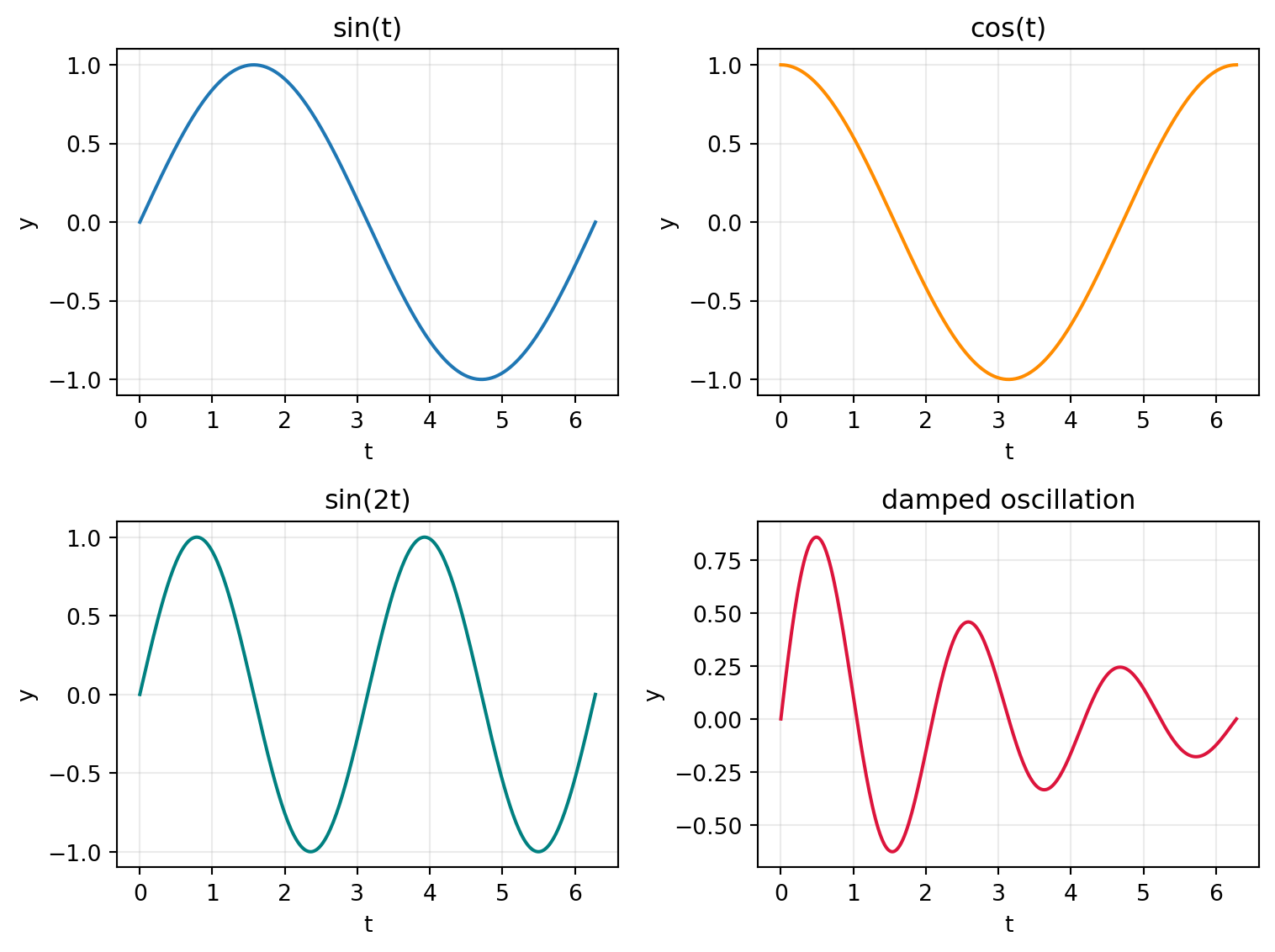
2 x 2 panel plot
Use plt.subplots(2, 2) to create a grid of four axes in one figure.
= np.linspace(0 , 2 * np.pi, 300 )= plt.subplots(2 , 2 , figsize= (8 , 6 ))0 , 0 ].plot(t, np.sin(t), color= "tab:blue" )0 , 0 ].set_title("sin(t)" )0 , 1 ].plot(t, np.cos(t), color= "darkorange" )0 , 1 ].set_title("cos(t)" )1 , 0 ].plot(t, np.sin(2 * t), color= "teal" )1 , 0 ].set_title("sin(2t)" )1 , 1 ].plot(t, np.exp(- 0.3 * t) * np.sin(3 * t), color= "crimson" )1 , 1 ].set_title("damped oscillation" )for ax in axes.flat:"t" )"y" )True , alpha= 0.25 )
2 x 2 panel plot: example plot
Matplotlib summary
1D function plots: plot, labels, ranges, styles, colors, log scales
Data visualization: points + error bars with errorbar
Distributions: hist
2D fields: contour, imshow (heatmap)
3D views: plot_surface
Multi-panel figures: plt.subplots(2, 2)
Next step: combine NumPy + Matplotlib for complete mini data analyses.
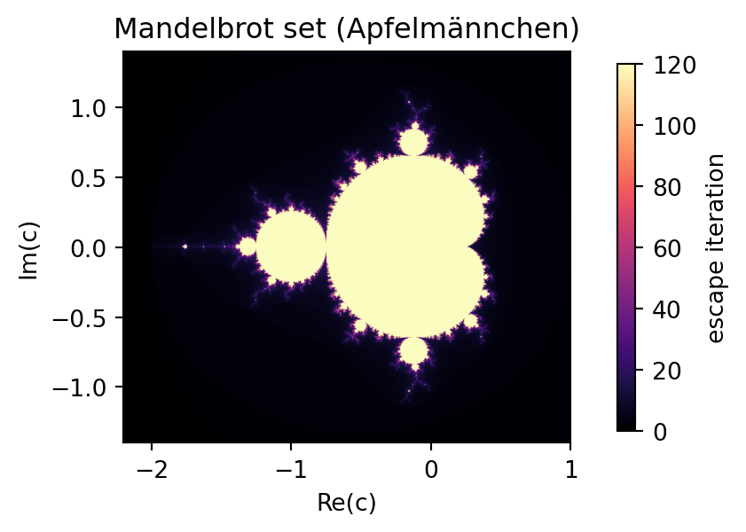
Mandelbrot set (Apfelmännchen)
For each complex number \(c = x + iy\) , define the iteration
\[
z_{n+1} = z_n^2 + c, \qquad z_0 = 0.
\]
If the sequence stays bounded, \(c\) belongs to the Mandelbrot set. In practice, we stop after max_iter steps and mark points that did not escape beyond \(|z| > 2\) .
Tasks:
Build a grid in the complex plane, e.g. \(x \in [-2.2, 1.0]\) , \(y \in [-1.4, 1.4]\) .
Iterate \(z \leftarrow z^2 + c\) for all grid points at once (vectorized NumPy).
Store for each point the first iteration where \(|z| > 2\) (escape time).
Plot the result with imshow and a perceptually clear colormap.
Solution: Mandelbrot set (Apfelmännchen)
import numpy as npimport matplotlib.pyplot as plt# Grid in the complex plane = 900 , 700 = np.linspace(- 2.2 , 1.0 , nx)= np.linspace(- 1.4 , 1.4 , ny)= np.meshgrid(x, y)= X + 1j * Y# Mandelbrot iteration = 120 = np.zeros_like(c)= np.full(c.shape, max_iter, dtype= int )= np.ones(c.shape, dtype= bool )for n in range (max_iter):= z[active] * z[active] + c[active]= active & (np.abs (z) > 2.0 )= n= False print ("escape_iter shape:" , escape_iter.shape)print ("max stored iteration:" , escape_iter.max ())
escape_iter shape: (700, 900)
max stored iteration: 120
Solution: Mandelbrot plot
= (4.4 , 5.6 ))= plt.imshow(= [x.min (), x.max (), y.min (), y.max ()],= "lower" ,= "magma" ,= "equal" = "vertical" , pad= 0.08 , shrink= 0.5 , label= "escape iteration" )"Re(c)" )"Im(c)" )"Mandelbrot set (Apfelmännchen)" )